Wednesday, January 16, 2013

USE IT TUESDAY BLOG - CHALLENGE #47 - MAKE IT SPARKLE

HAPPY NEW YEAR TO YOU!

Welcome to my blog.
Thank you for looking!

I am starting off my 2013 Blog Year
by entering a challenge that is sponsored by:

USE IT TUESDAY BLOG
This blog is run by an awesome group of women who just would like
to see that you... Use Your Stash. Take out those paper pads, and
embellishments and bling and get creative!
USE IT TUESDAY BLOG CHALLENGE #47
  -              MAKE IT SPARKLE        -

HERE IS THE LINK FOR THE CHALLENGE...
http://useittuesday.blogspot.ca/2013/01/challenge-47-make-it-sparkle.html

I took a tour of my stash, and created a card for this challenge.
I used metallic paper and bling to "Make It Sparkle".

FRONT OF CARD


BACK OF CARD


SUPPLIES AND TECHNIQUES


I took a deep breath and then plunged into my stash to pick out some  supplies for the card. (see picture to left)
I have a package of AC PAPER that I love because it
is metallic and so  I used the metallic teal colour
because it sparkles in any light.

I have some Maya Road chipboard pieces that I love.
A while ago, I bought some Recollections embellishment packages that I knew would be perfect for making a card or two. I decided it was time to use them.
A 9 X 10 inch piece of white paper (folded in half and
used as the base for the card)  and
miscellaneous ribbon rounded out the list of supplies.


I selected  pieces (see picture to left)
from the embellishment package to use
to create the card.

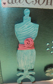
The dress form did not match the
card stock...
So I put gesso on it to cover up the
chipboard, and then  a layer
of Golden acrylic paint (teal).
This is a great way to obtain embellishments
that will match your colour scheme.

I put the bling in the middle of the flower
and on the card stock.

I used the twine as a belt for the dress form
and twisted the ends into a rosette shape.


SUPPLIES (CONTINUED)

misc.  glue, double-sided tape


At times, we feel as though it is too difficult to cut into
a piece of our favourite paper, or use a cherished embellishment,
but if we create something with it....it may become more meaningful.

BE BRAVE...USE YOUR STASH


I hope you enjoyed visiting my blog.
I would love it if you would leave a comment.
 
Thank you!
 
Karen


Tuesday, October 30, 2012

THE ALTERED ALICE BLOG CHALLENGE - CHAPTER 20- TWINKLE LIKE A BAT, SHINE LIKE A TEA TRAY


The Altered Alice Blog is a blog that would be on a list called
my "Top Ten Favourite Blogs".
If you have not visited this blog...I strongly urge you to take
a look.  I have been enjoying myself very much by entering
the challenges.  Take a chance, you may want to enter the
next challenge!

Every month the blog features a challenge that is inspired by
Alice in Wonderland.

Here is the link for challenge this month:  http://alteredalice.blogspot.ca/2012/10/week-3-chapter-20-twinkle-like-bat.html.

This month, blog readers were challenged to make a project
that Just like the Mad Hatter's song,  twinkles or shines, with bats being optional.


My project features a Mini Drama contained in 3 Frames.


MINI DRAMA
THE QUEEN OF HEARTS
CASTS A SPELL ON WONDERLAND.


FRAME 1:  - WONDERLAND IS DRAB AND DREARY

The Queen of Hearts was very, very unhappy one day and decided to
cast a spell on Wonderland so that it would match her mood.  She made
everything and everyone look and feel the way she did by allowing only
the colours Drab Brown and Dreary Beige to be part of their wardrobe.
Alice, who loved her blue wardrobe argued with the Queen and asked
her to undo the spell. 


FRAME 2: -  THE QUEEN TURNS EVERYONE INTO A PACK OF CARDS
 
The Queen, did not like anyone to disagree with her and decided to let Alice think
she would reverse the spell. 
"Okay Alice", said the Queen,  "I will bring back the the colourful world
you like so much".  She waved her royal hands in the air and chanted
something that Alice did not understand.
Soon everything in Wonderland was back to normal.  The people and things
were, once again, wonderful and colourful.
 
The only thing was...EVERYONE AND EVERYTHING
WAS TURNED INTO A PACK OF PLAYING CARDS!


FRAME 3: - ALICE MAKES EVERYTHING SPARKLE AND SHINE
 
Alice, who had jumped backwards when the Queen cast this last spell,
was spared from its effects.  She knew she had to help put Wonderland
back to normal (well...as normal as Wonderland could be).  She
remembered a story that the Cheshire Cat had told her about an
Enchanted Pumpkin Patch.  She gathered up all of the playing cards
she could see, and put them into a wheelbarrow to transport them to
this special pumpkin patch.  When she arrived there, she was not
sure what to do, but decided that she needed to plant each card in
a separate spot in the patch. 
 
After she had finished planting the cards, she was very tired and so
she took a nap, with her head resting against one of the pumpkins.
After a little while, she was awakened by sounds of laughter and singing.
It was now dark, although the moon was bright that night and
illuminated everything around her.
 
She sat up and looked around in wonder.  Then she jumped up,
clapping her hands and joining in the fun.  All around her, she could
see that each of the cards had been turned into a special pumpkin.
 
What emerged from the pumpkins was Amazing. 
 
Not only were the people and things back to their normal  and
colourful states...
 
But, even better than that...Everyone had beautiful crystals attached to them that Sparkled and Shone in the moonlight! 


THE END


MATERIALS USED:  
 
 
Paper :  Graphic 45 -  Halloween in Wonderland
 
Crystals:  Teresa Collins - Blingage.
 
Black Frames: Misc. 6X6 chipboard


Thank  you for visiting my blog today. 
 Please stay and leave a comment if you like.
 
 
 Karen


Friday, August 24, 2012

THE ALTERED ALICE BLOG CHALLENGE - CHAPTER 18: Now you see him...Now you don't !

Welcome back to my blog!

I am excited to make another post about one of my
favourite blogs...The Altered Alice Blog.
This quirky, fun, original, whimsical and sometimes wacky
blog features all things Alice In Wonderland.

Each month The Altered Alice Blog has a challenge.
This month we readers were invited to create a card
where things appear and disappear.

Here is the link for the challenge:  http://alteredalice.blogspot.ca/2012/08/week-1-chapter-18-now-you-see-him-now.html


I CREATED A CARD WITH A SURPRISE THAT CAN ONLY BE
REVEALED WHEN THE CARD IS OPENED.
I THINK IT IS PERFECT FOR A "MISSING YOU" CARD OR
A "WELCOME HOME" CARD.

 
ALICE, THE RABBIT AND THE MAD HATTER
ARE PATIENTLY AWAITING
A SPECIAL GUEST
FOR THEIR TEA PARTY....


CLICK ON CARD TO SEE A LARGER VERSION
FRONT OF THE CARD 
 

WELL..THEY WAITED,  AND THEY WAITED,  
AND THEN
THEY WAITED SOME MORE.

FINALLY... JUST BEFORE ALL THE TEA HAS
BEEN DRUNK AND ALL
THE LOVELY TEA CAKES HAVE BEEN EATEN...
THEIR SPECIAL GUEST ARRIVES!
                                         
 
TO REVEAL THE SPECIAL GUEST...I HAD TO OPEN THE CARD...
 
 
THEIR SPECIAL GUEST IS NONE OTHER THAN...
THE CHESHIRE CAT!


CLICK ON THE CARD TO SEE A LARGER VERSION

CARD WHEN IT IS OPEN


MATERIALS
 Paper:  Graphic 45 - Halloween in Wonderland
                                         
                                         Ink:  I used Tim Holtz distress ink in
                                         Tea Dye on the edges and the inside of the card


 I HOPE YOU ENJOYED SEEING MY SPECIAL CARD WHERE THINGS
APPEAR AND DISAPPEAR.
 
THANK YOU FOR VISITING AND PLEASE
FEEL FREE TO LEAVE A COMMENT.


    KAREN


Sunday, August 12, 2012

AUTHENTIQUE PAPER JULY INSPIRATION COLOR CHALLENGE

HELLO AGAIN EVERYONE!

Every month AUTHENTIQUE PAPER has challenges on their blog.

THERE ARE STILL A FEW DAYS TO ENTER THE
AUTHENTIQUE PAPER JULY INSPIRATION COLOR CHALLENGE.

HERE IS THE LINK :  http://blog.authentiquepaper.com/2012/07/july-inspiration-color-challenge.html.

THE COLORS WE HAD TO USE WERE KIWI, PINK LEMONADE, RASPBERRY
AND CHOCOLATE.

I TOOK MY INSPIRATION FROM THE QUILT IN THE STORY BOARD AND
CREATED A CARD THAT LOOKS LIKE AN OLD-FASHIONED QUILT.


FRONT OF THE CARD


CLOSE-UP OF SENTIMENTS ON FRONT OF CARD


BACK OF THE CARD


LOOK! ! ! ...WHEN  THE CARD IS LAID OUT FLAT

 IT IS AN OLD-FASHIONED QUILT
 (A PAPER ONE THAT IS!)


MATERIALS FOR THIS PROJECT

MY BASE CARD IS MISC. WHITE PAPER - 10 INCHES X 10 INCHES.

ALL OTHER PAPER WAS FROM AUTHENTIQUE PAPER.

 I CUT OUT FOUR STRIPS OF 2.5 X 5 INCHES FOR EACH SIDE OF THE CARD
SO THAT ALL FOUR COLORS ARE BOLDLY REPRESENTED. THEN I ADDED
CONTRASTING MINI BLOCKS TO THE TOP AND BOTTOM OF THE STRIPS.

KIWI :  DELIGHTFUL COLLECTION
PINK LEMONADE: FREE BIRD - BLUSH AND DELIGHT
RASPBERRY: (FLOWERED PAPER) FREE BIRD - BLUSH AND DELIGHT
CHOCOLATE:   FREE BIRD - ENDLESS AND FAIRWEATHER

SENTIMENTS :  RUB-ONS  STAMPIN UP
CHIPBOARD STICKER:  MISC.
LACE: MISC.
FINISHING TOUCHES:   I INKED THE EDGES OF THE CARD WITH DISTRESS INK
(TIM HOLTZ) IN BRUSHED CORDUROY


THANK YOU FOR VISITING MY BLOG.

I WOULD LOVE IT IF YOU WOULD LEAVE A COMMENT.

KAREN


INSPIRATION FROM AUTHENTIQUE PAPER'S JULY COLOR CHALLENGE


Wednesday, May 30, 2012

AUTHENTIQUE PAPER - MAY SKETCH CHALLENGE


MAY 30, 2012

Every month AUTHENTIQUE PAPER has a sketch challenge.
They provide a sketch and the challenge is to make a card or layout using the sketch.

Here is the link for the challenge : 
 http://blog.authentiquepaper.com/2012/05/may-sketch-challenge.html

I am very impressed with the high quality of the paper products from
Authentique Paper.  Most of the paper products are double-sided and textured and are made with very heavy cardstock. 

I like to buy the 6X6 inch paper pads for use in creating cards.
Authentique Paper's Free Bird Series  6X6 paper pads are made from 80 pound cardstock.  The paper has patterns on both sides and it is textured.  This is the perfect material for making professional-looking cards and I used it to create a card for this challenge.

BEST WISHES

FRONT OF CARD


BACK OF CARD


Materials used:  Authentique Paper Free Bird Series
(6X6 paper pad) Poised and Warmth.
The edges of the card were inked with Tim Holtz
distress ink - Brushed Corduroy.
Miscellaneous:  Sentiments (rub-ons) and brown flower lace.


Thank you very much for visiting my blog.
I appreciate receiving comments.

Karen


Wednesday, April 11, 2012

THE ALTERED ALICE BLOG - CHAPTER 14 CHALLENGE - SPLENDIDLY DRESSED

HAPPY APRIL TO YOU!  
TIME SEEMS TO JUST...WELL...FLY LATELY.
Outside, on my front lawn, in the rock garden, things are really starting to bloom.  Crocuses are sprouting up in all their splendour.

The Altered Alice blog has a challenge that fits right into the theme of splendour. 
The blog's theme is all things Alice in Wonderland and this month's challenge is called... SPLENDIDLY DRESSED.
The blog is fun and quirky and lovely and yes..splendid.
HERE IS THE LINK TO THE BLOG AND THE CHALLENGE:
http://alteredalice.blogspot.ca/2012/04/week-1-chapter-14-challenge-splendidly.html

Here is my entry for the challenge:

THE PERFECT HAT FOR ALICE

One day, Alice looked in the mirror and sighed.  It was a sigh so long and loud that the butterflies came to investigate. 
"Always the same", said Alice, sighing once again.
"What is the matter?", asked the blue and purple and pink dotted butterfly. 
"I always look the same", Alice said sadly.
The butterfly looked at her, fluttered her wings,
and excitedly cried  "Come with me my dear child, and
we will soon fix that!"
Off Alice went, following the butterfly as it flit here
and there.  In time, they came to a shop
owned by Goldilocks.

Here is what happened next...

original artwork Karen C. Goulet copyright 2012

Alice tried on hats until she found the one that did not
make her look "the same" anymore.
It was "just right".  In fact, it was "PERFECT". 
Alice skipped off with her new butterfly friend to show off
her new hat.  No more sighs for her.

I used my original artwork to create this piece.
The sketch of Alice was made using  Faber-Castell Pit Artist pens.
These are pigmented India ink
pens that have various nib sizes (fine medium and brush). 
I made the hats and the flower using paper from Tim Holtz's Paper Stashes
Lost and Found and Vintage Shabby. The background paper was from a
Tim Holtz Paper Stash called Retro Grunge.

I hope you enjoyed visiting my  blog.
and that you will return again very soon.
I would love it if you would leave a comment.
(see comment bar at bottom of this blog)

Thank you!

Karen


Monday, April 2, 2012

AUTHENTIQUE PAPER - MARCH SKETCH CHALLENGE - CARD #2 OF 2

EVERY MONTH AUTHENTIQUE PAPER has a sketch challenge.
Here is the link for the sketch challenge for March.

http://blog.authentiquepaper.com/2012/03/march-sketch-challenge.html

You must make a separate project for each entry in the challenge.

I decided to make TWO CARDS FOR THIS CHALLENGE.
THIS IS THE SECOND CARD THAT I CREATED. 
CARD # 2 OF 2

The paper was mounted on a  5 1/2  x 4  inch blank white card.
FRONT OF THE CARD


 I used the sketch to create the design of the card.
All of the paper on the card is from Authentique Paper's  Free Bird Series
(front - Delight, back - Comfort)
in a 6X6 inch pad format.
As a mixed media artist, I like to purchase the 6 X6 inch pads for cardmaking purposes.
Some 6X6 pads from different companies are packaged as single-sided smooth cardstock.
However, The Authentique 6 X 6 inch pad from the Free Bird series has the
same high quality, heavy cardstock and the paper is double-sided and textured just like
the 12 X 12 inch paper in the same series.
It makes my cards look and feel professional.
Embellishments on the front:   miscellaneous lace, Tim Holtz tissue tape - Symphony,
misc. stamp on misc. piece of doily paper and bling.
BACK OF CARD


I like to back my cards with a coordinating paper.
I feel that it makes the card look richer and more "finished'.
I inked the edges and back of the card with Tim Holtz distress ink in Victorian Velvet colour.
I hope you enjoyed visiting my blog.
Please feel free to leave a comment.
Thank you!
Karen

AUTHENTIQUE PAPER MARCH SKETCH CHALLENGE -CARD #1 OF 2

EVERY MONTH AUTHENTIQUE PAPER  has a sketch challenge.
Here is the link for the sketch challenge for March.

http://blog.authentiquepaper.com/2012/03/march-sketch-challenge.html

You must make a separate project for each entry into the challenge.
I decided to make TWO CARDS FOR THIS CHALLENGE.  

CARD # 1 OF 2

The paper was mounted on a  5 1/2  X  4   inch blank white card.

FRONT OF THE CARD


I used the sketch to create the design of the card.
All of the paper on the card is from Authentique Paper's Free Bird Series (Delight)
 in a 6X6 inch pad format.
I added some miscellaneous bling and ribbon from my stash to
make the design true to the sketch.

As a mixed media artist, I like to purchase the 6 X6 inch  pads for cardmaking purposes.
Some 6X6 pads from different companies are packaged as single-sided smooth cardstock.
However, The Authentique 6 X 6 inch pad from the Free Bird series has the
same high quality, heavy cardstock and the paper is double-sided and textured just like
the  12 X 12 inch paper in the same series. 
It makes my cards look and feel professional. 
. 

BACK OF CARD


I like to back my cards with a coordinating paper.
I feel that it makes the card look richer and more "finished'.
I inked the edges of the card with Tim Holtz distress ink in Tattered Rose colour.

Thank you for your visit to my blog!
I enjoy receiving comments.

Karen


Wednesday, March 21, 2012

THE ALTERED ALICE BLOG - CHAPTER 13 CHALLENGE: BEST BUTTER

HAPPY SPRING EVERYONE!

It has been mighty warm here this week and this is very unusual for this
time of year.


So...the strange sunny days fit right in with the lovely and quirky 
THE ALTERED ALICE BLOG.
This is a blog inspired by all things from the novel Alice in Wonderland. 


THE ALTERED ALICE BLOG - CHAPTER 13 CHALLENGE:  BEST BUTTER.

HERE IS THE LINK TO THE BLOG AND THE CHALLENGE:
http://alteredalice.blogspot.ca/2012/03/week-1-chapter-13-challenge-best-butter.html


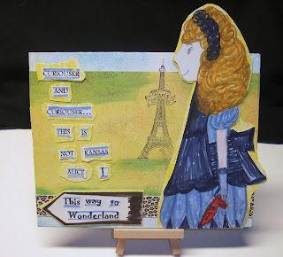
I CREATED A 9x7 INCH CANVAS FOR THIS CHALLENGE.
THIS IS NOT KANSAS ALICE !

I MADE A SKETCH OF MY VERSION OF ALICE, using a fine lead artist pencil.
I made her larger than the canvas to create dimension.
Then, I coloured in the sketch with Faber-Castell Pit Artist pens. 
These are pigmented india ink
pens that have various nib sizes (fine medium and brush).  The ruby shoe was  coloured with red oil pastel and then embellished with red glitter.


original artwork Karen C. Goulet  copyright 2012

The Alice figure, Wonderland sign and words are mounted on dry medium paper
that has been shaded with yellow oil pastel (like butter!).

I then assembled the canvas, using a yellow paper (like butter!) from
Authentique Paper's  Foundations series
as a background. 
The top and bottom of the canvas was inked with a Faded Jeans distress ink from
the Tim Holtz collection.  The stamp is from Inkadinkado.
The leopard ribbon is a miscellaneous piece from my stash.

I hope you enjoyed your visit to my blog.
and that you will return again very soon.

Thank you!

Karen


Wednesday, February 29, 2012

AUTHENTIQUE PAPER FEBRUARY SKETCH CHALLENGE - CARD 3 OF 3

Hi there everyone!
Welcome back to my blog.

Authentique Paper rocks! 

Authentique Paper has a sketch challenge for February and I
created 3 special cards for it. 
Here is the link:  http://blog.authentiquepaper.com/2012/02/february-sketch-challenge.html

Here is the final card of the set for this challenge - Card #3 of 3.


front of the card
This is an all-occasion card.


I used paper from Authentique's 6X6 Paper Bundle Journey to make all the paper elements for this card.
I love the vintage feel of the design.

Inking the edges of the paper with Tim Holtz distress ink in Faded Denim is a nice accent for the card.

I added some miscellaneous lace from my stash to complement the paper. 

The  flower embellishment was made using a paper punch.  The edges of the petals were inked with the Faded Denim distress ink.

The sentiment is a sticker from Bo Bunny.

back of the card
 

The polka dots on this paper are gorgeous.

Again, I inked the edges of the paper with Tim Holtz distress ink but I used Chipped Sapphire  this time.

Thank you for stopping by.
I would love to have your comments.

Karen

Saturday, February 25, 2012

AUTHENTIQUE PAPER FEBRUARY SKETCH CHALLENGE - CARD 2 OF 3

Hello again everyone!

I just want to say...I LOVE AUTHENTIQUE PAPER!

Authentique Paper has a challenge on their blog.  You can look at the challenge and the rules by clicking on the following link: http://blog.authentiquepaper.com/2012/02/february-sketch-challenge.html

I created a set of 3 cards for the challenge.

Here is finished Card  #2 of  3.

front of the card
This is a beautiful "pretty in pink" card.


The only paper used on this card is from Authentique Paper.
I love the quality of the paper and the wonderful designs.
Their 6X6 bundles are perfect for card-making and scrapbooking alike.  The price points are also delightful.

For the base I used a fuchsia paper from the Delight Collection.
The embellishment strips were cut from paper in the
6X6 Bundle Collection:  Splendid.

The sentiment "Love" is a miscellaneous  rub-on that has been applied to a square of Authentique Paper (6X6Bundle Collection: Splendid).

I inked the edges of the paper with Tim Holtz distress ink in Worn Lipstick.

I used some miscellaneous fuchsia ribbon and crystals from my stash to add a few more feminine touches to the creation.

back of the card


I wanted the back of the card to be just as bold and pretty as the front of the card so I used more of the paper that appears on the front of the card.
I love the way the paper looks like vintage wallpaper.

Thank you for looking at my blog.
Do you like the card?
Please leave a comment to let me know what you think.

Karen  

Friday, February 24, 2012

AUTHENTIQUE PAPER - FEBRUARY SKETCH CHALLENGE - CARD 1 OF 3

Greetings to all!

I ADORE AUTHENTIQUE PAPER!

I made 3 special cards for the Authentique Paper Challenge.
Here is the link:  http://blog.authentiquepaper.com/2012/02/february-sketch-challenge.html

This is Card #1 of 3. 


I added tiny butterflies  (made from Authentique Paper) to the card to give it some dimension.
I added ribbon to further embellish the card and to follow the structure given in the sketch.


This is the front of the card.
This card makes me smile. It has a nice vintage feel.


For the front of the card I used the following Authentique Paper:  base and embellishment strips :6X6 Bundle Collection -   Blissful
sentiment "adore" :  6X6 Bundle Collection - Splendid

I inked the edges of the base paper and the embellishment strips
and the paper on the back of the card with Tim Holtz Distress Ink in Wild Honey.
Some Maya Road ribbon made the finishing touch.

Here is a picture of the back of the card:


back of the card:  Authentique Paper: 
6X6 Bundle Collection: Blissful.


Thank you for visiting my blog!
I welcome comments.

Karen


Sunday, February 19, 2012

SIMON SAYS STAMP AND SHOW CHALLENGE - ANYTHING GOES

Simon Says Stamp and Show has a challenge every week.
The challenge for this week was Anything Goes.
Here is the link:  http://simonsaysstampandshow.blogspot.com/2012/02/simon-says-stamp-and-show-anything-goes.html

I created a special Valentine Art Piece. 
"Darling Be Mine"

I added an easel stand to the back of it so it can be displayed anywhere.

To create the base for this creation, I covered a 6X6 inch piece of black chipboard with pink paper from Crate Paper.

Then, I created the puffy heart as the focal point for the piece. I used small pieces of Authentique Paper (Free Bird Collections : Blush, Warmth and Delight) to form a collage on top of a tattered heart made from white paper. The collage was then sealed with Golden gel medium.

I inked the edges of the heart with Worn Lipstick distress ink from the Tim Holtz collection

Here is the finished art piece:   "Darling Be Mine"


I wanted the piece to have a vintage feel to it so I used a lot of vintage-style embellishments when I created it.

The embellishments were from various sources.

wooden number and heart - Maya Road
chipboard darling, bee and key - Prima 
old fashioned valentine card  - 7 Gypsies
fuchsia ribbon:  Donna Downey for Prima
chipboard letters - Fancy Pants
Eiffel Tower - EK Success
misc. items from my stash:  pearl flower, ribbon, buttons, crown, clothespin and ticket

Thank you for visiting my blog.
I appreciate receiving comments.

Karen   


.